Air Transformed
with Miriam Quick
What if we could really see and feel the burden that air pollution places on our bodies?
Air Transformed is a series of wearable data objects that communicate this physical burden in different ways. Though seemingly decorative, they are based entirely on open air quality data from Sheffield, UK, a former steelmaking city and notorious for its bad air.
Our task was to create friendly, accessible pieces that used open air quality data to inspire public engagement with the issue of air pollution.
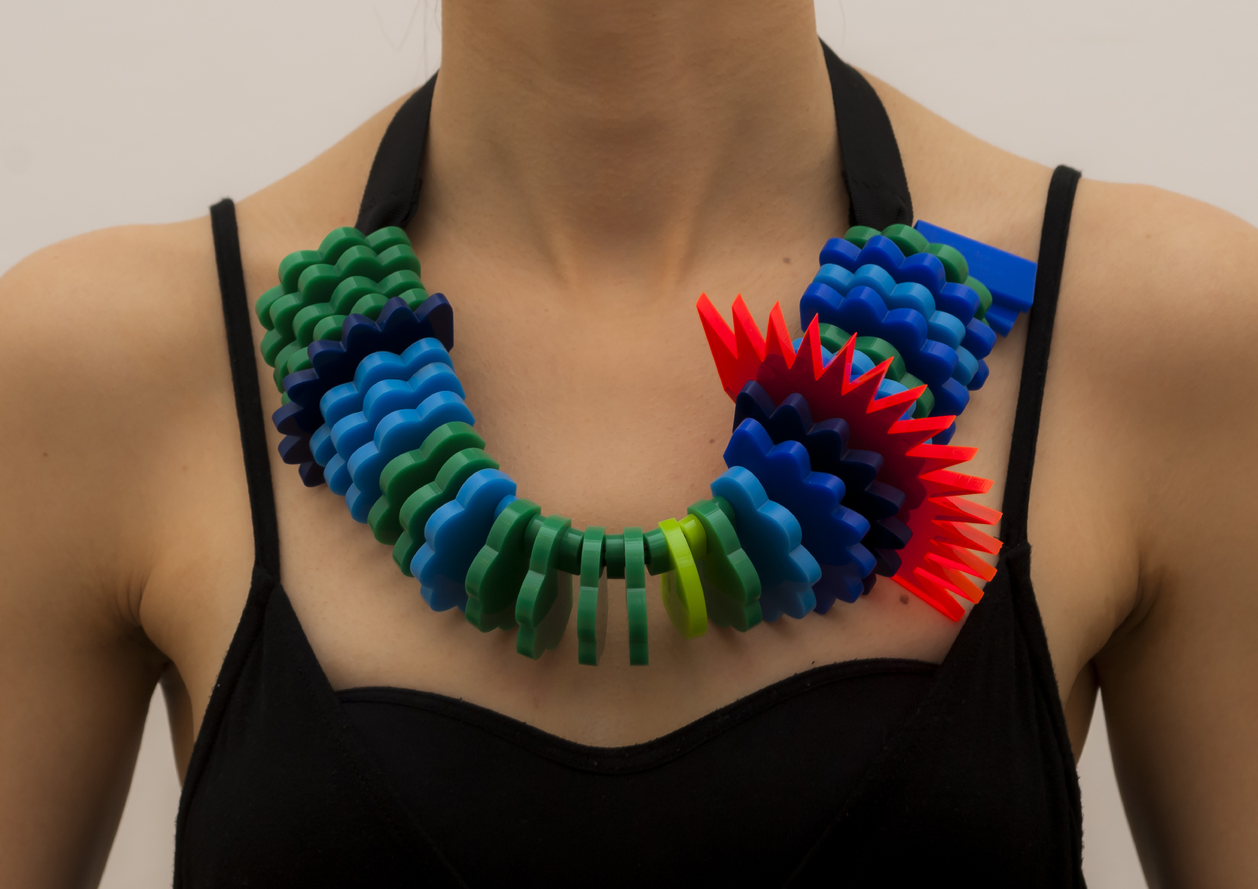
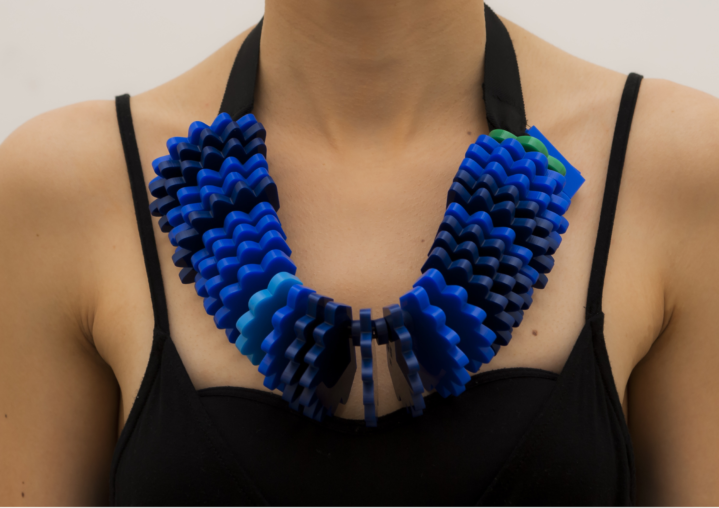
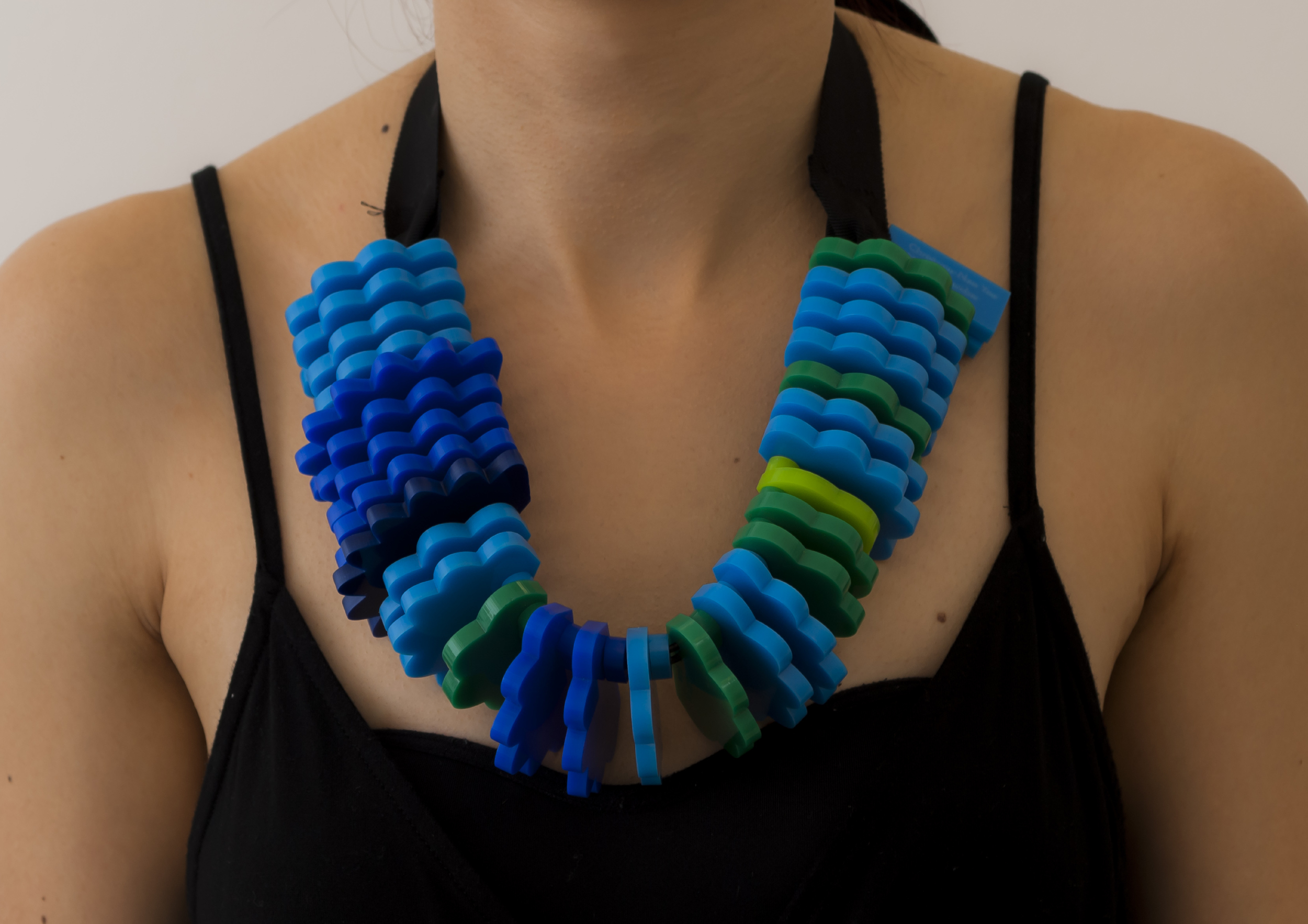
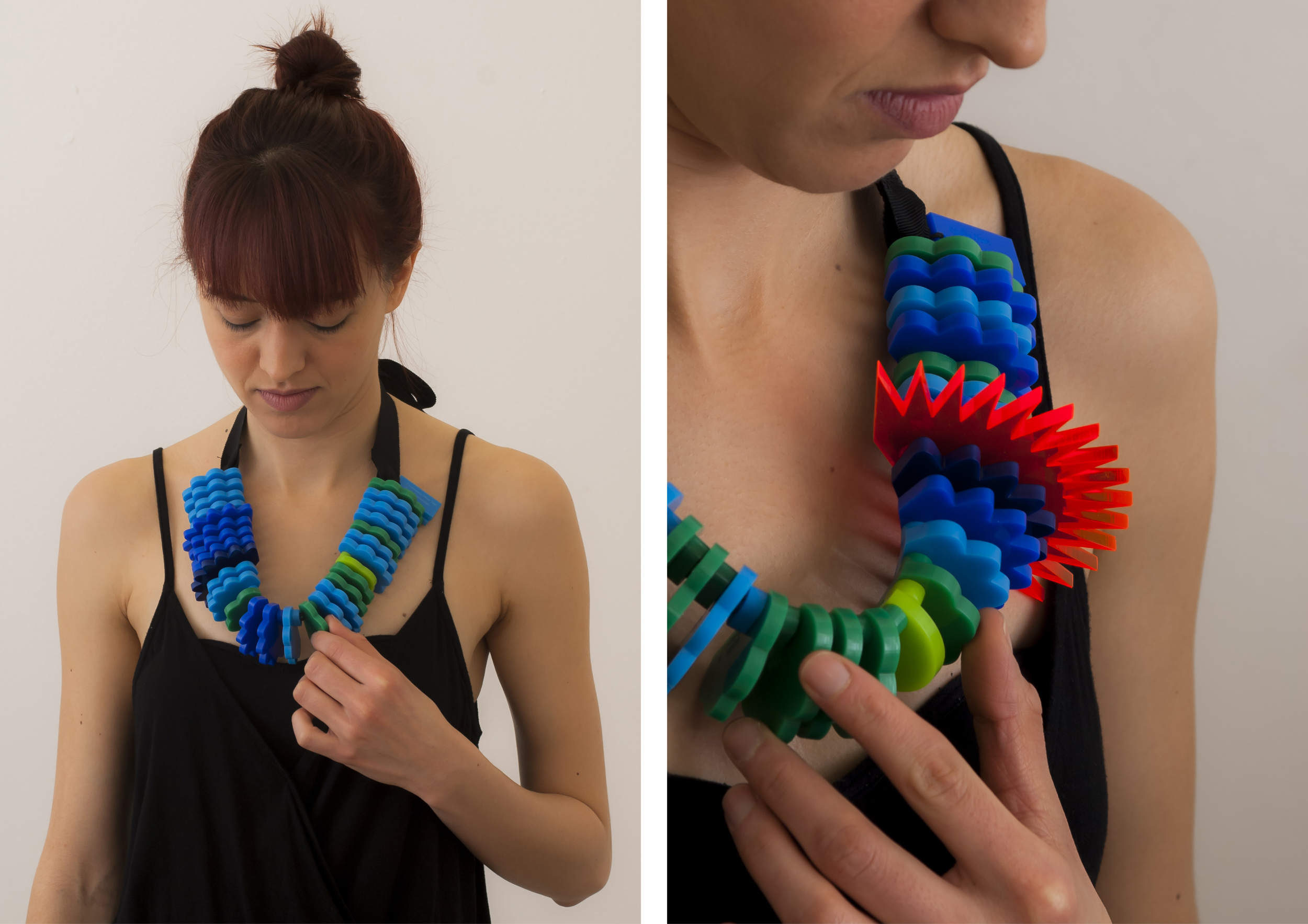
Touching Air
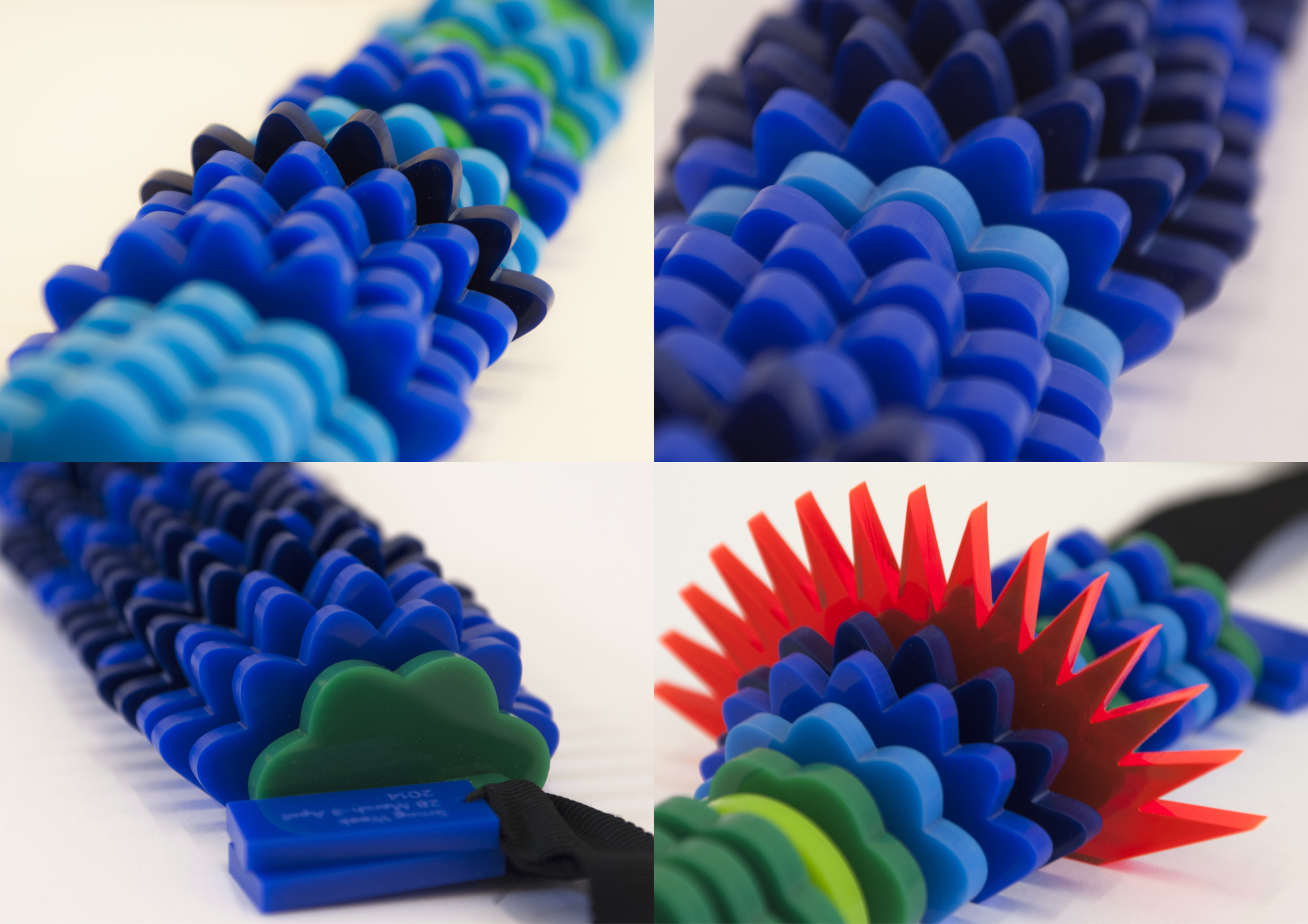
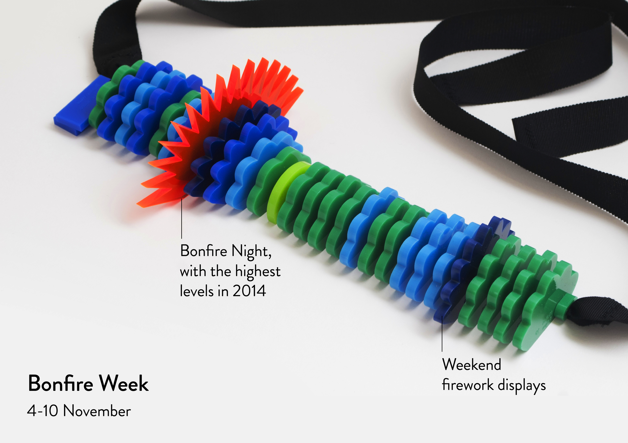
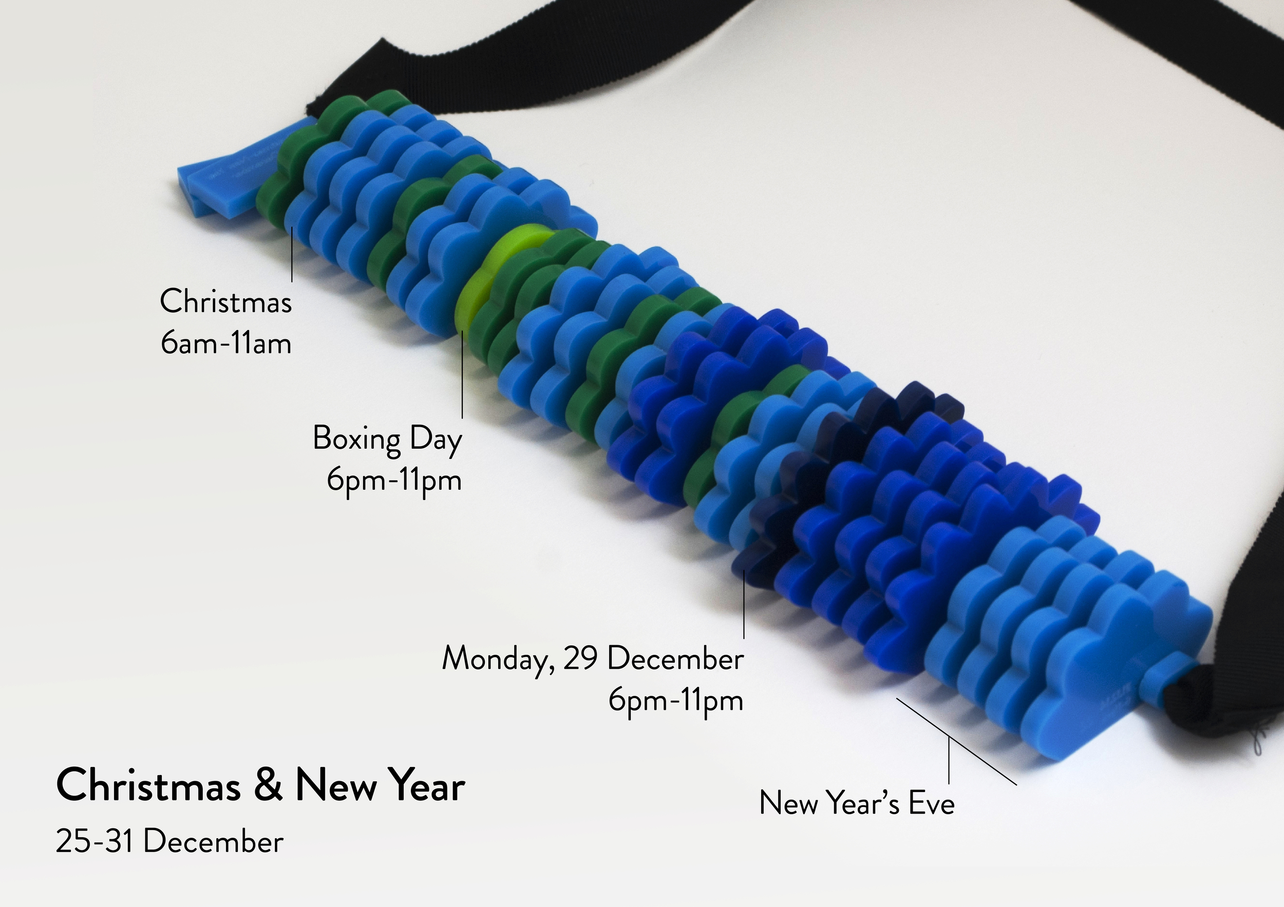
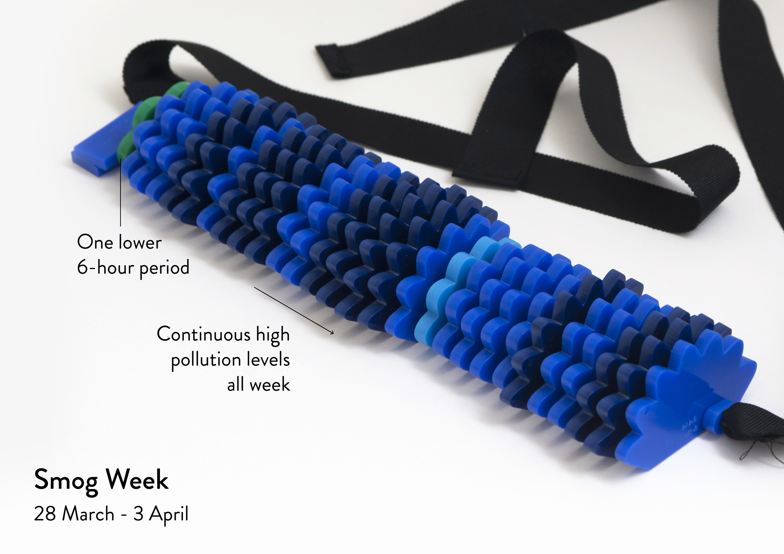
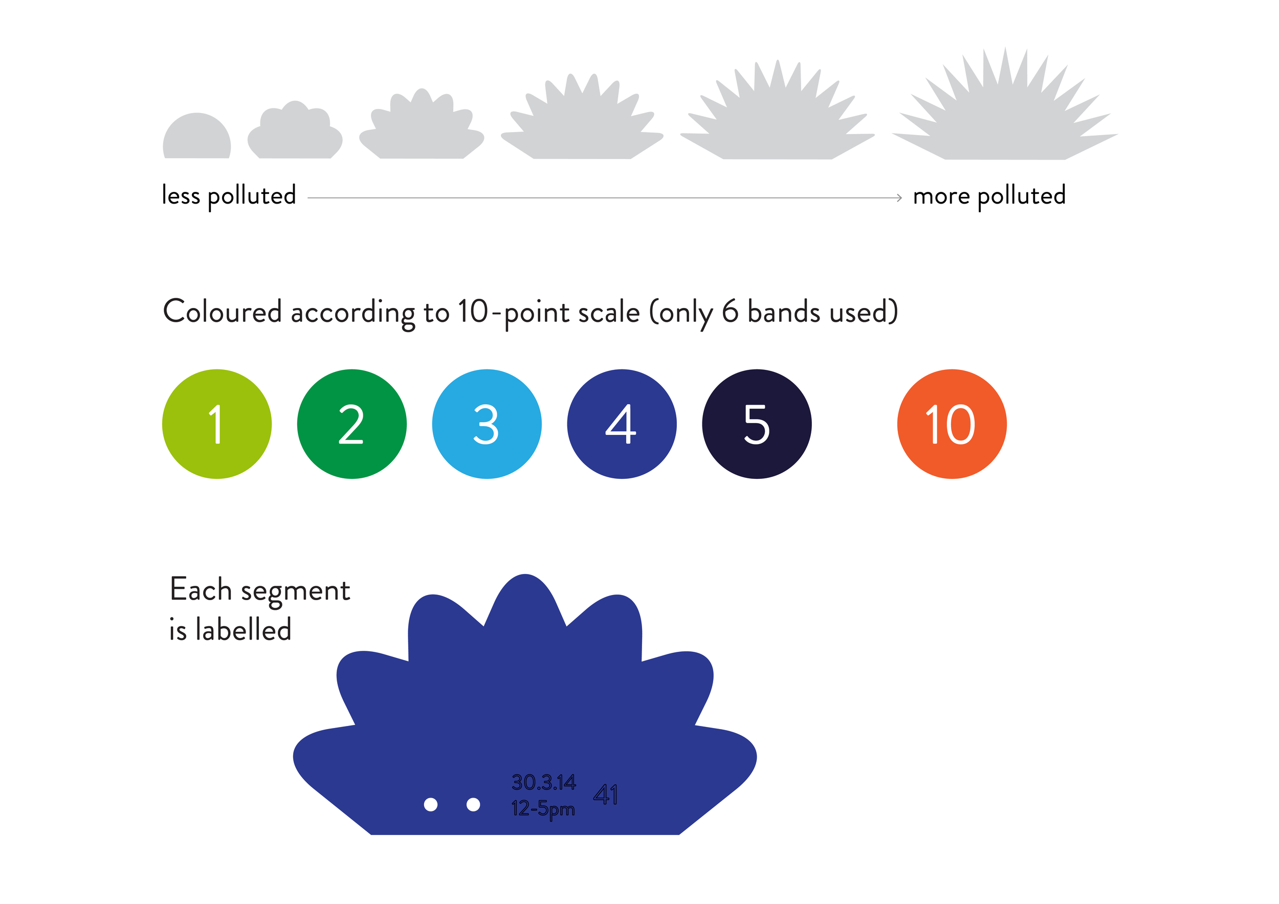
Touching Air comprises three necklaces made of perspex segments of different textures.
Each necklace represents a week's worth of data from sensors measuring large particulate (PM10) levels. Since particulate matter damages the heart and lungs, we felt a neckpiece was an appropriate way of communicating this data.
The segments range in size from small to large and in texture from completely smooth to spiky and sharp to touch; the larger and spikier the segment, the more particulates in
the air at that time.
By running their fingers over each necklace, the wearer can literally feel how the air quality in Sheffield went up and down over the course of each week. Dangerous particulate levels have the potential to hurt/prick the finger of the wearer.
Interpreting the neckpieces
We divided each week of data into 28 six-hour periods and used a perspex segment to represent the average PM10 level in each one. The six-hour periods correspond roughly to morning, afternoon, evening and night of each day.
We chose to depict three weeks of data that highlighted particularly interesting patterns of PM10 in Sheffield in 2014.
(Note: for interpretation, these photos have been flipped horizontally for your benefit, as the data moves chronologically from left to right for the wearer, not the wearer's friends!)
Seeing Air
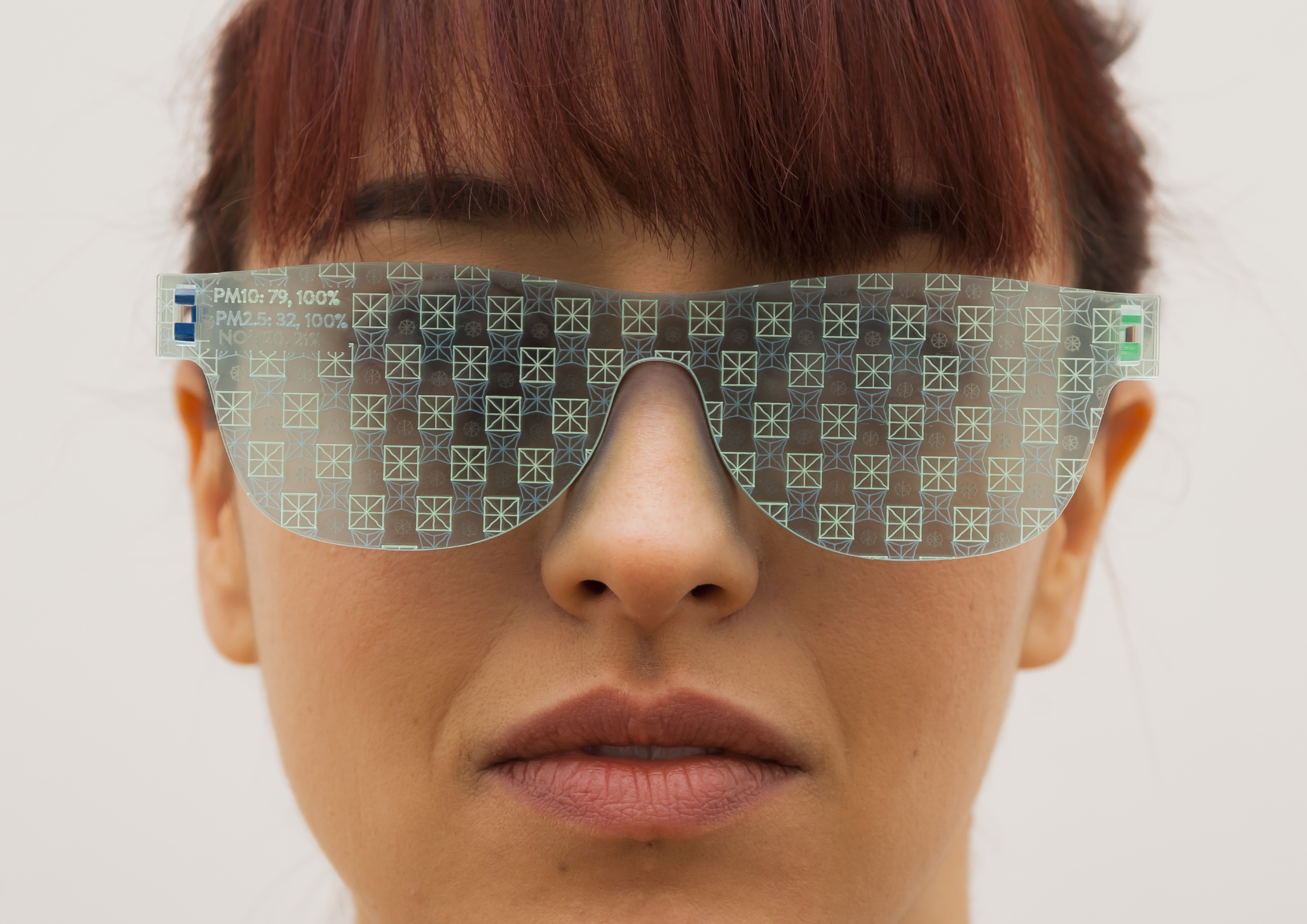
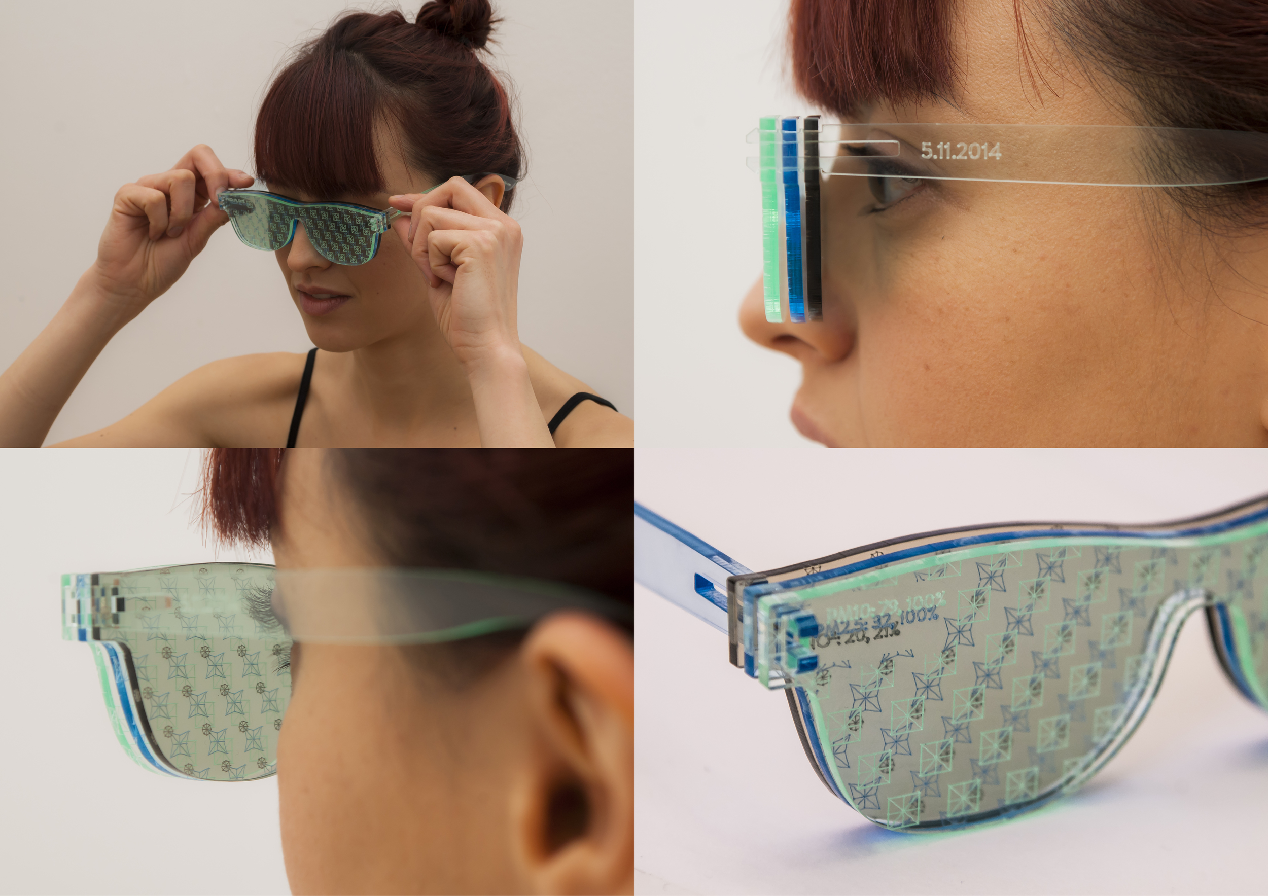
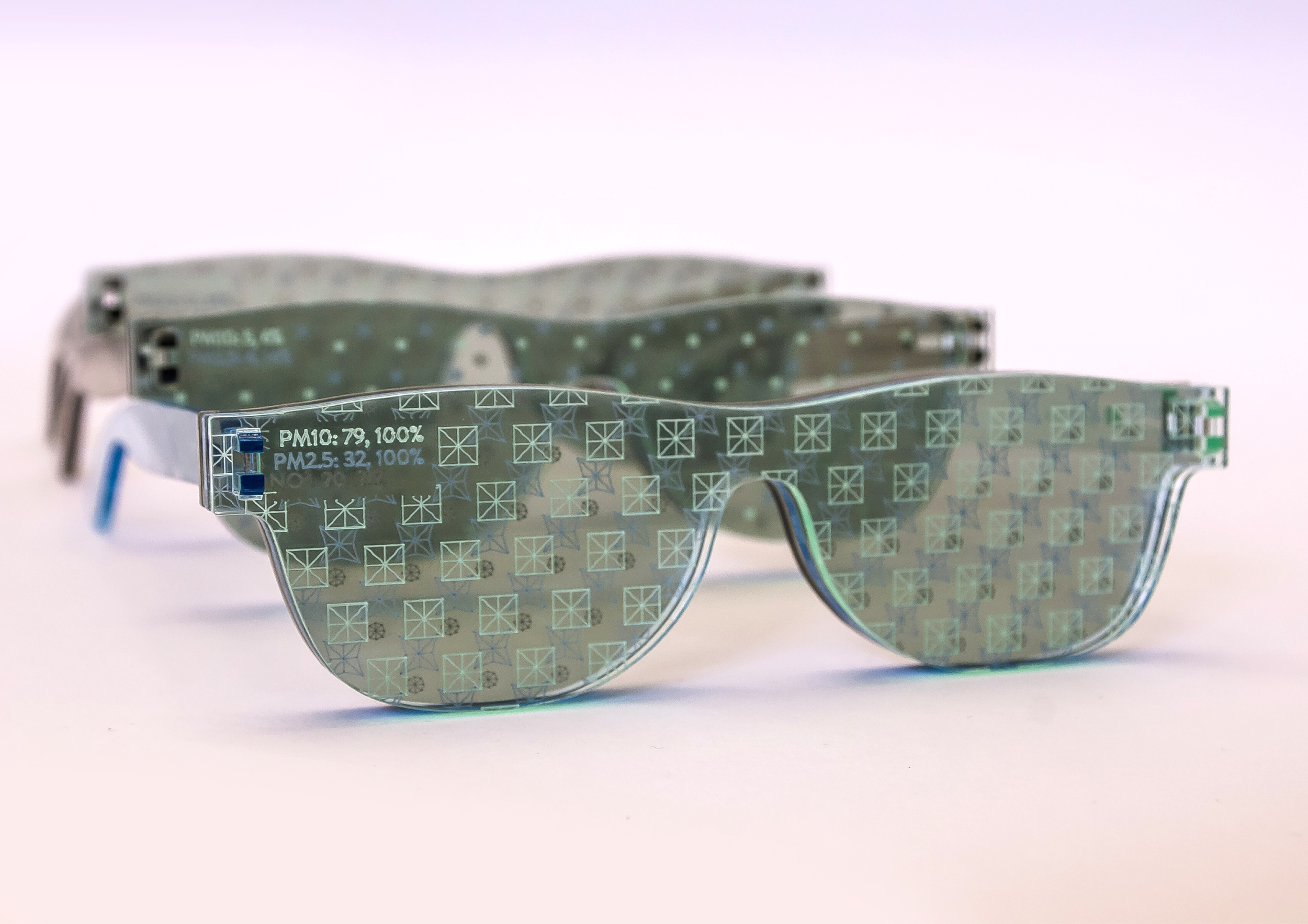
Seeing Air comprises three pairs of glasses, each with three
perspex lenses.
Each pair of glasses represents the levels of air pollution on a different day in Sheffield during 2014, averaged over the whole day.
Each lens represents a different pollutant: nitrogen dioxide (brown lens), small particulates (blue lens) or large particulates (green lens).
Higher levels of pollutant are indicated by a larger pattern on the lens. This clouds the wearer's vision, alluding to the hazy views caused by pollutants in the air.
By wearing the glasses, the wearer can literally see differences in air quality in Sheffield on different days of the year.

Interpreting the eyewear
Each lens represents a different pollutant. Larger patterns represent higher pollutant levels, while lower levels are represented by smaller patterns whose dimensions are determined wholly by the data.
The larger patterns cloud the wearer's vision, providing a subtle indicator of differences in pollution levels between days. We wanted to ensure the data on the glasses could be experienced in two ways: as a physical, subtle experience when worn and as a graphic presentation of the data when the glasses were held and looked at, and compared to others in the series.
The absolute values in µg/m³ and the percentage of the maximum daily value for the year for each pollutant are etched on each lens.
The days we chose to represent fall at the extremes of the air quality range for the city: a day with high NO2, a day with high particulates and a day of relatively clean air.
In more detail
Our process
The pieces are based on open data from up to three air quality sensors around Sheffield, provided by Sheffield City Council. (We accessed the raw data here and here.) I designed the pieces, while Miriam Quick did all of the data research and analysis.
The commission
The pieces were commissioned by Better With Data, the Sheffield wing of the Open Data Institute, as part of their AirQuality+ project.
The pieces were presented at the AirQuality+ launch event in Sheffield in January 2015 and will be on display at the Sheffield Institute of Arts during February and March 2015 alongside works by the other commissioned artists: Kasia Molga and Adrian Godwin, and Kingsley Ash.
Photos: Steve McInerny
Model: Ashley Smith

A highly professional portrait of two collaborators